Why FMCG Distribution Needs a KPI Dashboard
Here is an uncomfortable truth about FMCG distribution in India: the majority of brand owners are flying blind. They make decisions about territory expansion, distributor appointments, scheme budgets, and sales force deployment based on month-end Excel reports that are already stale by the time they arrive. In a market where FMCG distribution moves at the speed of daily secondary sales, monthly reporting is the equivalent of driving a car by looking only in the rearview mirror.
Consider the cost of delayed information. A distributor in Mumbai has been consistently under-ordering a high-margin SKU for three weeks. A salesman in Delhi has not been following his beat plan for 12 days. A scheme meant to push summer beverages is being claimed by retailers who are not even stocking the product. By the time these issues surface in a month-end review, the damage is done: lost sales, wasted scheme budgets, and eroded retailer relationships that take months to rebuild.
The brands that consistently outperform their competition, whether they are legacy players like Hindustan Unilever and ITC or aggressive challengers disrupting categories, share one trait: they are obsessively data-driven. They do not wait for reports. They watch dashboards. They set thresholds. They act on real-time deviations, not historical summaries.
A well-designed FMCG distribution KPI dashboard transforms distribution management from reactive firefighting to proactive optimization. It gives brand owners, sales heads, area sales managers, and even distributors themselves a shared, real-time view of what is working and what is not. And in a market as competitive as Indian FMCG, that visibility is the difference between growing at 8% and growing at 25%.
This guide covers the 15 distribution KPIs that matter most, how to build a dashboard around them, what each role in your organization should see, and how to avoid the most common mistakes brands make when implementing analytics. Whether you manage dairy distribution or a multi-category FMCG portfolio, these metrics apply universally.
The 15 Essential Distribution KPIs
Not all KPIs are created equal. Some are leading indicators that predict future performance; others are lagging indicators that confirm what already happened. The best dashboards combine both. Here are the 15 metrics every FMCG brand owner in India must track, with definitions, formulas, benchmarks, and context on why each one matters.
1. Secondary Sales vs Target
Definition: The ratio of actual secondary sales (distributor-to-retailer) to the target set for a given period, expressed as a percentage. This is the single most important metric in FMCG distribution because it measures demand fulfillment at the point closest to the consumer.
Formula: (Actual Secondary Sales / Target Secondary Sales) x 100
Benchmark: 90%+ is healthy. Consistently below 85% signals structural problems in either target-setting or execution.
Why it matters: Primary sales (company-to-distributor) can be inflated through channel stuffing. Secondary sales cannot be faked. They represent real consumer demand being served through your distribution network. Tracking secondary sales vs target at the territory, distributor, and SKU level gives you the truest picture of market performance. Read our detailed breakdown in Primary vs Secondary Sales: The Complete FMCG India Guide.
2. OTIF Rate (On Time In Full)
Definition: The percentage of orders delivered to retailers on time and in full, meaning the correct quantity of every ordered SKU arrived within the promised delivery window. OTIF combines two dimensions of service quality into one powerful metric.
Formula: (Orders Delivered On Time AND In Full / Total Orders) x 100
Benchmark: 95%+ is the target for well-run distribution operations. Below 90% and you are actively losing retail shelf space to competitors.
Why it matters: Retailers in India have limited shelf space and even more limited patience. When a distributor fails to deliver on time or delivers partial quantities, the retailer fills that shelf space with a competitor product. Every OTIF failure is a direct invitation for your competition to take your shelf. SpireStock's order management module tracks OTIF automatically from order placement through OTP-verified delivery.
3. Outlet Coverage Percentage
Definition: The percentage of total mapped retail outlets in a territory that have been visited and serviced within a defined period (typically monthly). This measures the breadth of your distribution reach.
Formula: (Outlets Visited and Billed / Total Mapped Outlets) x 100
Benchmark: 85%+ for established territories. New territories should show a consistent upward trajectory toward this target within 90 days.
Why it matters: An uncovered outlet is lost revenue, period. If your salesman is visiting only 70% of mapped outlets, you are leaving 30% of your potential market unserved and vulnerable to competition. More critically, outlet coverage data helps you identify whether the problem is route design, salesman productivity, or inaccurate outlet mapping. Use distribution tracking to monitor coverage in real time and retailer tracking solutions to maintain an accurate universe count.
4. SKU Velocity
Definition: The average number of units of a specific SKU sold per outlet per month. SKU velocity tells you how fast a product moves through your distribution channel at the retail level.
Formula: Total Units Sold / Number of Outlets Stocking the SKU / Number of Months
Benchmark: Varies dramatically by category. For a fast-moving dairy SKU, 50+ units/outlet/month is strong. For a premium FMCG product, 10-15 units/outlet/month might be excellent. The key is benchmarking each SKU against its own category and price tier.
Why it matters: SKU velocity separates your heroes from your laggards. A product with wide distribution but low velocity is eating shelf space without generating returns. A product with narrow distribution but high velocity is screaming for expansion. Velocity data drives assortment decisions, scheme design, and new product launch strategy. Sales analytics dashboards should make SKU velocity visible at glance across every territory.
5. Fill Rate
Definition: The percentage of ordered quantity that is actually fulfilled from available stock at the distributor point. Fill rate measures how well your supply chain keeps up with demand.
Formula: (Quantity Shipped / Quantity Ordered) x 100
Benchmark: 98%+ is the gold standard. Below 95%, you are hemorrhaging sales to stockouts.
Why it matters: Every percentage point of fill rate below 100% represents lost sales. In fast-moving categories like dairy and beverages, a single day of stockout at the distributor level can mean hundreds of retailers going unfilled. Fill rate problems cascade: low fill rate leads to low OTIF, which leads to retailer dissatisfaction, which leads to lost shelf space. Monitor fill rate daily, not monthly, and set up automated alerts for any distributor dropping below 95%.
6. Stock Aging / Days of Inventory
Definition: The average number of days inventory sits at the distributor point before being sold to retailers. For perishable FMCG and dairy products, this metric is existential.
Formula: (Average Inventory Value / Cost of Goods Sold per Day)
Benchmark: 15-25 days for general FMCG. 3-7 days for perishable dairy. Above 30 days for non-perishables signals overstocking or demand problems.
Why it matters: Excess inventory ties up distributor working capital, increases expiry risk, and often leads to distress selling that damages brand pricing. Too little inventory causes stockouts and lost sales. The sweet spot varies by category, but monitoring days of inventory at every distributor point helps you optimize primary dispatch quantities and frequencies. For dairy distribution, where shelf life is measured in days, stock aging is literally a life-or-death metric for your product.
7. Claim TAT (Turnaround Time)
Definition: The average number of days from when a distributor submits a claim (scheme reimbursement, damage claim, rate difference, expiry return) to when it is fully resolved and credited.
Formula: Sum of (Claim Resolution Date - Claim Submission Date) / Total Claims Resolved
Benchmark: Less than 7 days. Industry average in India is 15-25 days, which is a major source of distributor dissatisfaction.
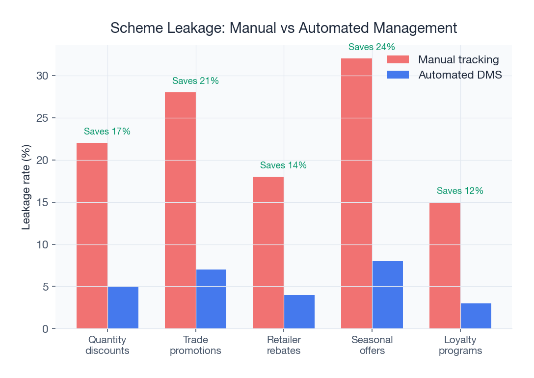
Why it matters: Slow claim resolution is the number one reason distributors lose trust in a brand. When a distributor submits a legitimate scheme claim and waits 30 days for resolution, they start questioning whether to push that brand's products. Every day of delayed claim resolution erodes your distributor's ROI and motivation. Brands that resolve claims within 7 days consistently have 20-30% higher distributor engagement scores. Learn how to prevent scheme-related issues in Scheme Leakage Prevention for FMCG Brands.
8. Credit Utilization Ratio
Definition: The percentage of the total credit limit extended to a distributor that is currently being utilized. This metric balances growth enablement with financial risk management.
Formula: (Outstanding Credit Amount / Total Credit Limit) x 100
Benchmark: 70-85% is the healthy range. Below 60% means the distributor is under-ordering relative to capacity. Above 90% means they are close to their limit and may face order blocks.
Why it matters: Credit utilization is a leading indicator of both opportunity and risk. A distributor consistently at 50% utilization is either under-performing or has been given an inflated credit limit. A distributor perpetually at 95% is either growing fast and needs a limit revision, or is slow on collections and heading toward a bad debt situation. The context determines the action, but the dashboard must surface this data proactively.
9. Productive Call Percentage
Definition: The percentage of retail outlet visits made by your field sales team that result in an order being placed. A visit without an order is a non-productive call.
Formula: (Visits Resulting in Orders / Total Visits) x 100
Benchmark: 60%+ is healthy for established territories. New territories may start at 30-40% and should improve to 60% within 6 months.
Why it matters: If your salesman visits 40 outlets a day and only 20 result in orders, you are paying for 20 wasted visits. Low productive call percentage could indicate poor SKU assortment, wrong visit frequency, pricing issues, or simply poor salesmanship. This metric, tracked daily per salesman, is the most direct measure of field force effectiveness. Attendance and activity tracking combined with order data gives you productive call metrics automatically. For deeper insights into optimizing field productivity, see our guide on sales productivity solutions.
10. Returns Percentage
Definition: The percentage of total sales value that is returned by retailers to the distributor, for reasons including damage, expiry, wrong delivery, or quality complaints.
Formula: (Value of Returns / Total Sales Value) x 100
Benchmark: Less than 3% of sales value. Above 5% is a red flag requiring immediate investigation.
Why it matters: Returns are pure margin destruction. Every returned product costs you the product value, the logistics cost of delivery and return, the salesman time to process it, and the administrative cost of credit notes. High returns typically indicate one of four problems: poor demand forecasting leading to overstocking, inadequate cold chain for perishables, quality control issues, or order fulfillment errors. Tracking returns by reason code, territory, distributor, and SKU helps you pinpoint the root cause and fix it.
11. Scheme ROI
Definition: The return generated by trade promotion schemes relative to their cost. This measures whether your scheme spending is actually driving incremental sales or simply rewarding existing behavior.
Formula: (Incremental Sales Value from Scheme - Scheme Cost) / Scheme Cost
Benchmark: 2x+ return. If a scheme costs Rs 5 lakh, it should generate at least Rs 10 lakh in incremental sales.
Why it matters: Indian FMCG brands spend 12-18% of revenue on trade promotions. That is crores of rupees flowing through schemes every quarter. Yet most brands cannot tell you which schemes actually worked and which were money pits. Without scheme ROI tracking, you are essentially distributing charity to the trade channel. A configurable scheme management engine that tracks claims against actual sales uplift is essential. Brands that measure scheme ROI ruthlessly and kill underperforming schemes typically save 15-25% of their scheme budget while improving results.
12. DSR Compliance Percentage
Definition: The percentage of Daily Sales Reports submitted by the field sales team on time and with complete information. DSR compliance measures the discipline and data hygiene of your field force.
Formula: (DSRs Submitted On Time and Complete / Total DSRs Expected) x 100
Benchmark: 95%+ is the target. Below 90% means your data is unreliable and your dashboard is showing an incomplete picture.
Why it matters: Every KPI on this list depends on accurate, timely data from the field. If your salesmen are not submitting DSRs consistently, your secondary sales data is wrong, your productive call percentage is wrong, and your beat adherence metrics are unreliable. DSR compliance is a meta-metric: it tells you whether you can trust your other metrics. Modern field force apps with auto-capture capabilities (GPS, timestamp, photo proof) push DSR compliance above 95% by making reporting effortless rather than burdensome.
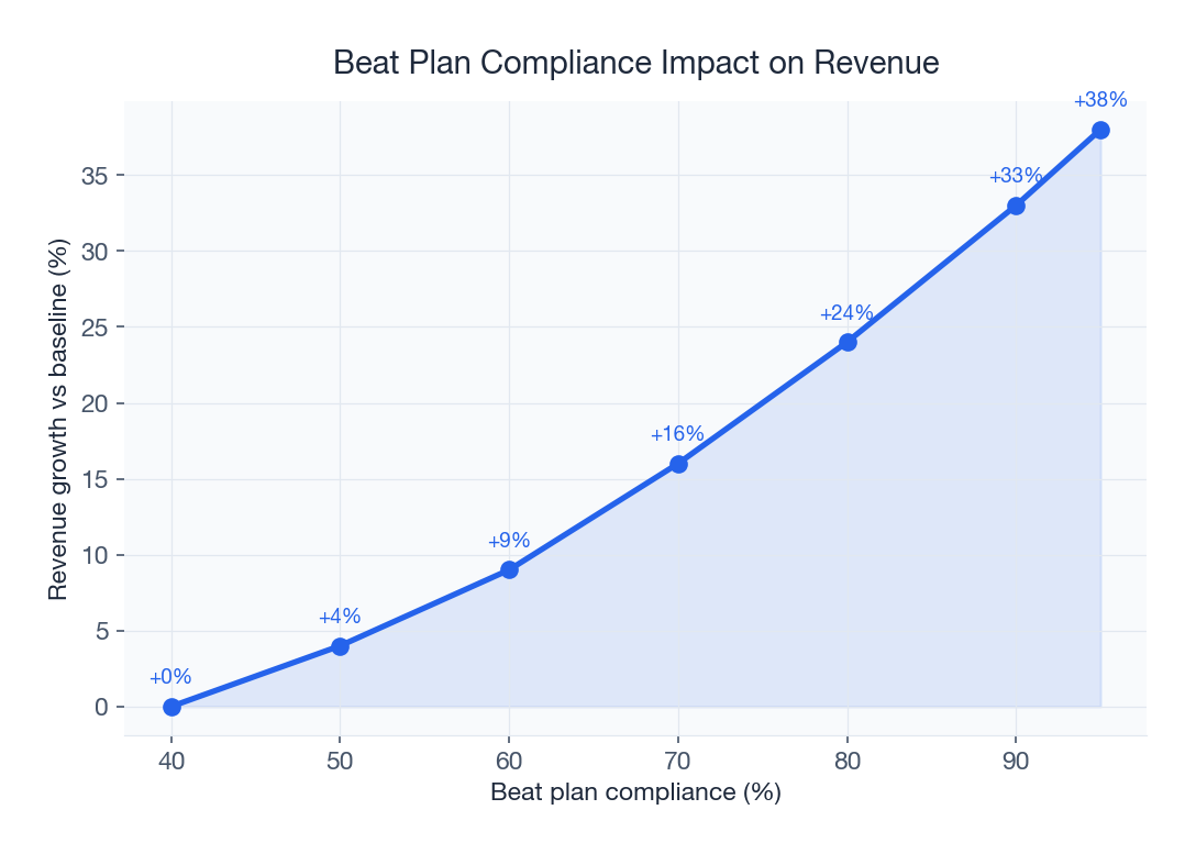
13. Beat Adherence Percentage
Definition: The percentage of planned beat visits that the field salesman actually completes as per the defined beat plan. This measures route discipline.
Formula: (Actual Outlets Visited per Beat Plan / Planned Outlets in Beat) x 100
Benchmark: 90%+ for mature territories. Deviation below 80% requires intervention.
Why it matters: Beat plans exist for a reason. They ensure every outlet gets visited at the right frequency, they optimize travel time, and they maximize the number of productive hours in a salesman's day. When a salesman deviates from his beat, some outlets get over-visited (wasted time) and others get neglected (lost sales). Beat planning software with GPS-verified check-ins makes beat adherence measurable and coachable. Territory managers should review beat adherence daily and address deviations within 24 hours.
14. Distributor ROI
Definition: The return on investment that a distributor earns from carrying your brand, expressed as a percentage of their invested capital (stock value + receivables + infrastructure) per month.
Formula: (Monthly Gross Margin - Monthly Operating Costs) / Total Capital Employed x 100
Benchmark: 15%+ monthly ROI keeps distributors motivated and loyal. Below 10% and they start evaluating competitor brands.
Why it matters: Your distributor is your most important business partner, and they are in it for the money. A distributor earning 18% monthly ROI from your brand will fight for shelf space, invest in infrastructure, and push your schemes enthusiastically. A distributor earning 8% ROI is already meeting with your competitor. Most brands do not even calculate distributor ROI, which means they cannot diagnose why certain distributors are disengaged. Track this metric per distributor and use it to calibrate margins, credit limits, and scheme support. Our distributor management solution gives both you and your distributors visibility into ROI metrics.
15. Order-to-Delivery Cycle Time
Definition: The elapsed time from when a retailer places an order to when the delivery is completed and verified. This is the ultimate measure of distribution speed.
Formula: Delivery Timestamp - Order Placement Timestamp (measured in hours)
Benchmark: Less than 24 hours for urban markets. 24-48 hours for semi-urban. For dairy and perishables, same-day delivery (less than 12 hours) is non-negotiable.
Why it matters: In the age of instant gratification and quick commerce, traditional distribution timelines are compressing fast. A retailer who places an order Monday morning and receives it Wednesday afternoon is not getting served; they are getting neglected. Short order-to-delivery cycles reduce the retailer's need to hold buffer stock, improve freshness for perishable products, and create a perception of reliability that drives repeat orders. Track cycle time end-to-end and break it down by stage (order processing, dispatch, transit, delivery) to identify bottlenecks.
How to Build Your Distribution Dashboard
Tracking 15 KPIs sounds overwhelming, and for brands just starting their data journey, it is. The practical approach is to start small and expand systematically.
Phase 1: Start with 5 Core KPIs (Month 1-2)
Begin with the five metrics that give you the most immediate visibility into distribution health:
- Secondary sales vs target - your north star metric
- OTIF rate - your service quality indicator
- Outlet coverage percentage - your reach indicator
- Productive call percentage - your field force effectiveness indicator
- Fill rate - your supply chain health indicator
These five metrics alone will give you more visibility than 90% of Indian FMCG brands currently have. Get these right before adding complexity.
Phase 2: Add Operational Depth (Month 3-4)
Once your core KPIs are stable and the team is comfortable with data-driven reviews, add:
- Beat adherence percentage
- DSR compliance percentage
- Returns percentage
- Stock aging / days of inventory
- Order-to-delivery cycle time
Phase 3: Add Strategic Metrics (Month 5-6)
With operational metrics humming, layer in the strategic KPIs:
- SKU velocity
- Scheme ROI
- Distributor ROI
- Credit utilization ratio
- Claim TAT
Data Sources You Need to Connect
A dashboard is only as good as the data feeding it. Here are the four critical data sources and what they contribute:
| Data Source | KPIs It Feeds | Update Frequency |
|---|---|---|
| Distribution Management System (DMS) | Secondary sales, fill rate, stock aging, OTIF, order cycle time | Real-time |
| Field Force Automation App | Beat adherence, productive calls, DSR compliance, outlet coverage | Real-time (GPS synced) |
| Billing/Invoicing System | Returns, credit utilization, claim TAT, primary sales | Daily batch or real-time |
| Accounting/ERP System | Distributor ROI, scheme ROI, financial metrics | Daily or weekly batch |
The ideal setup is real-time data from all four sources flowing into a unified dashboard. However, even daily batch processing from your billing and accounting systems delivers 80% of the value. The critical requirement is that your DMS and field force app provide real-time data, because those feed the metrics that require immediate action.
Dashboard Design Best Practices
A dashboard that nobody uses is worse than no dashboard at all, because it creates a false sense of data-driven management. Here are the design principles that separate effective dashboards from expensive wallpaper.
Visual Hierarchy: What Hits You First
The most important KPIs should occupy the top third of the screen and be the largest visual elements. For an FMCG distribution dashboard, secondary sales vs target should be the hero metric, visible within one second of opening the dashboard. Supporting metrics should be arranged in descending order of urgency, not alphabetical order or arbitrary grouping.
Color Coding: The Traffic Light System
Adopt a consistent RAG (Red, Amber, Green) color coding across all metrics:
- Green: metric is at or above benchmark (e.g., OTIF at 96%)
- Amber: metric is within 5-10% of benchmark (e.g., OTIF at 91%)
- Red: metric is significantly below benchmark (e.g., OTIF at 85%)
The human eye processes color faster than numbers. A dashboard where everything is green tells you instantly that operations are healthy. A single red indicator demands investigation. Define your green, amber, and red thresholds for each KPI upfront and keep them consistent.
Drill-Down Capability: From National to Outlet Level
A good dashboard lets you see the big picture and then zoom in. When secondary sales vs target shows 87% nationally, you should be able to click through to see which regions are dragging it down, which territories within those regions, which distributors within those territories, and ultimately which SKUs are underperforming at which outlets. The drill-down path should be: National, then Region, then Territory, then Distributor, then Outlet, then SKU.
Mobile-Friendly Design
Your CEO checks dashboards on their phone during meetings. Your ASM checks them between market visits on their two-wheeler. Your distributor checks them on a tablet at their godown. If your dashboard does not work flawlessly on mobile devices, you have lost 60% of your potential users. Responsive design is not optional. Touch-friendly controls, legible fonts at mobile sizes, and landscape-orientation charts are essential.
Automated Alerts on Threshold Breaches
The most powerful feature of a modern KPI dashboard is not the pretty charts, it is the automated alerts. When OTIF drops below 90% for a distributor, the ASM should get a push notification. When beat adherence for a territory falls below 80%, the territory manager should get an SMS. When stock aging crosses 25 days at any distributor point, the supply chain head should get an email. Alerts turn passive monitoring into active management.
Role-Based Dashboards
One of the biggest mistakes brands make is building a single dashboard and showing it to everyone. A CEO drowning in beat-level data will stop looking at dashboards entirely. A salesman overwhelmed by financial metrics will ignore the dashboard. The solution is role-based views that show each user exactly what they need to act on, nothing more and nothing less.
The CEO Dashboard (3-5 Strategic KPIs)
The CEO needs a 30-second view of distribution health. Their dashboard should show:
- Secondary sales vs target (national and regional rollup)
- Overall OTIF rate (trend over 90 days)
- Scheme ROI (aggregated by scheme type)
- Distributor ROI (distribution of ROI across all distributors)
- Revenue growth trend (vs same period last year)
No detail. No drill-downs unless they explicitly want them. Just five numbers and their trends. If everything is green, the CEO moves on. If something is red, they call the sales head.
The Sales Head Dashboard (Territory Performance)
The sales head needs to compare territories, identify patterns, and allocate resources. Their dashboard adds:
- Territory-wise secondary sales achievement (ranked)
- Regional OTIF and fill rate comparison
- Top and bottom 10 distributors (by sales achievement)
- Outlet coverage trends by region
- SKU velocity heat map (which products are hot where)
- Scheme performance summary
The ASM Dashboard (Beat-Level Operations)
The Area Sales Manager is the execution engine. Their dashboard is operational and daily:
- Today's beat adherence for each salesman
- Productive call percentage (today, this week, this month)
- DSR compliance status (who has and has not submitted)
- Distributor stock levels (which ones are running low)
- Returns and claims pending
- Order-to-delivery cycle time
The ASM dashboard should be mobile-first, because ASMs spend 70% of their time in the field. Attendance and location tracking feeds directly into the ASM's view of team productivity.
The Distributor Dashboard (Their Own Metrics)
Smart brands give distributors visibility into their own performance. This is not about surveillance; it is about partnership. The distributor dashboard should show:
- Their secondary sales vs target
- Their fill rate and OTIF rate
- Their ROI and margin metrics
- Pending claims and their status
- Credit utilization and outstanding
- Scheme benefits earned and pending
When a distributor can see their own numbers in real time, two things happen: they self-correct problems before you have to intervene, and they trust your data because they can verify it themselves. This transparency is a competitive advantage. SpireStock's distributor management solution provides exactly this kind of partner-facing dashboard.
Common Dashboard Mistakes
Building dashboards is easy. Building dashboards that actually improve business outcomes is hard. Here are the six most common mistakes Indian FMCG brands make with their KPI dashboards, and how to avoid each one.
Mistake 1: Too Many KPIs
The enthusiasm of a first-time dashboard builder leads to a screen with 30+ metrics, charts, and tables. Nobody can process that much information. Cognitive overload leads to dashboard abandonment. Start with 5 KPIs per role and never exceed 8 on a single screen. Everything else should be one click away, not on the homepage.
Mistake 2: No Benchmarks
Showing that your OTIF rate is 91% is meaningless without context. Is 91% good or bad? What was it last month? What is the industry standard? Every metric on your dashboard must have a benchmark, a target, and a trend indicator. Numbers without context are noise, not intelligence.
Mistake 3: Lagging Indicators Only
Dashboards that show only last month's results are history books, not management tools. Your dashboard must include leading indicators like today's beat adherence, this week's productive calls, and current stock levels that predict future outcomes. A mix of 40% leading and 60% lagging indicators is a good starting point.
Mistake 4: No Action Triggers
The best dashboards do not just show problems; they trigger actions. When beat adherence drops below 80%, the dashboard should not just turn red. It should generate a task for the territory manager to investigate. When distributor stock aging crosses 25 days, the system should auto-generate a review notification. Without action triggers, dashboards become wallpaper that people glance at and forget.
Mistake 5: Vanity Metrics
Total downloads, total retailers mapped, total orders placed. These cumulative, ever-increasing numbers make everyone feel good but tell you nothing about current performance. Replace vanity metrics with actionable ones. Instead of total retailers mapped, show outlet coverage percentage. Instead of total orders, show productive call percentage. If a metric cannot lead to a specific action, it does not belong on your dashboard.
Mistake 6: Ignoring Data Quality
A dashboard built on dirty data is worse than no dashboard at all because it creates false confidence. Before worrying about visualization, ensure your DSR compliance is above 95%, your outlet master data is clean, and your billing data is reconciled. Track DSR compliance as a KPI precisely because it is the foundation on which every other metric rests.
How SpireStock's Analytics Dashboard Works
SpireStock's distribution analytics platform is purpose-built for Indian FMCG and dairy distribution, designed from the ground up to deliver the 15 KPIs described in this guide without requiring a data science team or custom development.
Real-Time Data from the Field
Every action taken through SpireStock's mobile app, whether it is a retailer visit check-in, an order placement, a delivery confirmation, or a crate handover, flows into the analytics engine in real time. There is no end-of-day batch upload, no manual data entry, and no Excel intermediary. Sales analytics dashboards refresh continuously throughout the day, giving you a live view of distribution performance from the moment your first salesman starts their beat.
Configurable Widgets
Every user can configure their dashboard layout by adding, removing, and rearranging KPI widgets. The sales head can create a territory comparison view. The supply chain manager can build a stock health monitor. The CEO can set up a five-metric strategic overview. Widget configuration is drag-and-drop, requires no technical knowledge, and persists across devices so your mobile dashboard mirrors your desktop view.
Automated Alerts and Notifications
SpireStock's alert engine monitors all 15 KPIs against configurable thresholds and sends push notifications, SMS alerts, or emails when breaches occur. Set your OTIF threshold at 90%, and every distributor that drops below gets flagged automatically. Set your beat adherence threshold at 85%, and every salesman deviating gets highlighted for their ASM. Alerts include context: which metric breached, the current value, the threshold, and the trend direction, so the recipient can act immediately.
Export and Reporting Capabilities
For brands that still need periodic reports for board meetings, distributor reviews, or regulatory compliance, SpireStock supports one-click export to PDF and Excel. Scheduled reports can be auto-generated and emailed daily, weekly, or monthly. The reporting engine supports custom date ranges, territory filters, and distributor-level drill-downs, so you can generate exactly the report you need without manual data manipulation. Distribution tracking data flows seamlessly into every export.
Ready to see these dashboards in action? Book a free demo and we will walk you through the analytics platform with your own data. See our pricing plans for options that fit your scale.
Case Study: How DataFresh Foods Transformed Distribution Performance with KPI Dashboards
DataFresh Foods is a mid-sized FMCG brand operating across three states in western India, Gujarat, Maharashtra, and Rajasthan, with a portfolio spanning dairy products, packaged beverages, and snack foods. With 280 distributors, 1,800 retail outlets, and a 45-person field sales team, they represent the typical Indian FMCG company: big enough to have complexity, small enough that every inefficiency hurts.
The Situation Before Dashboards
Before implementing KPI dashboards, DataFresh's distribution operations ran on a monthly review cycle. The sales head received Excel reports from ASMs on the 5th of each month for the previous month's performance. These reports were manually compiled from Tally billing data, handwritten DSRs, and phone calls to distributors. The data was inconsistent: each ASM used a different format, definitions varied (one ASM counted productive calls differently from another), and by the time discrepancies were resolved, it was the 15th of the month, halfway through the next period.
The results were predictable. Secondary sales achievement hovered at 78%, well below target. Three distributors had quietly stopped ordering key SKUs, and nobody noticed for six weeks. Scheme spending was Rs 1.8 crore annually, but nobody could tell which schemes were working. Returns were running at 4.2% of sales, nearly double the industry benchmark. Beat adherence was an unknown metric because nobody was tracking it.
The Implementation
DataFresh implemented SpireStock's distribution platform with a phased KPI dashboard rollout following the three-phase approach described earlier. In Month 1, they activated five core KPIs: secondary sales vs target, OTIF rate, outlet coverage, productive calls, and fill rate. They set aggressive but achievable thresholds and configured automated alerts for their ASMs and sales head.
By Month 3, they added beat adherence, DSR compliance, returns tracking, stock aging, and order-to-delivery cycle time. By Month 6, all 15 KPIs were live, including scheme ROI and distributor ROI calculations.
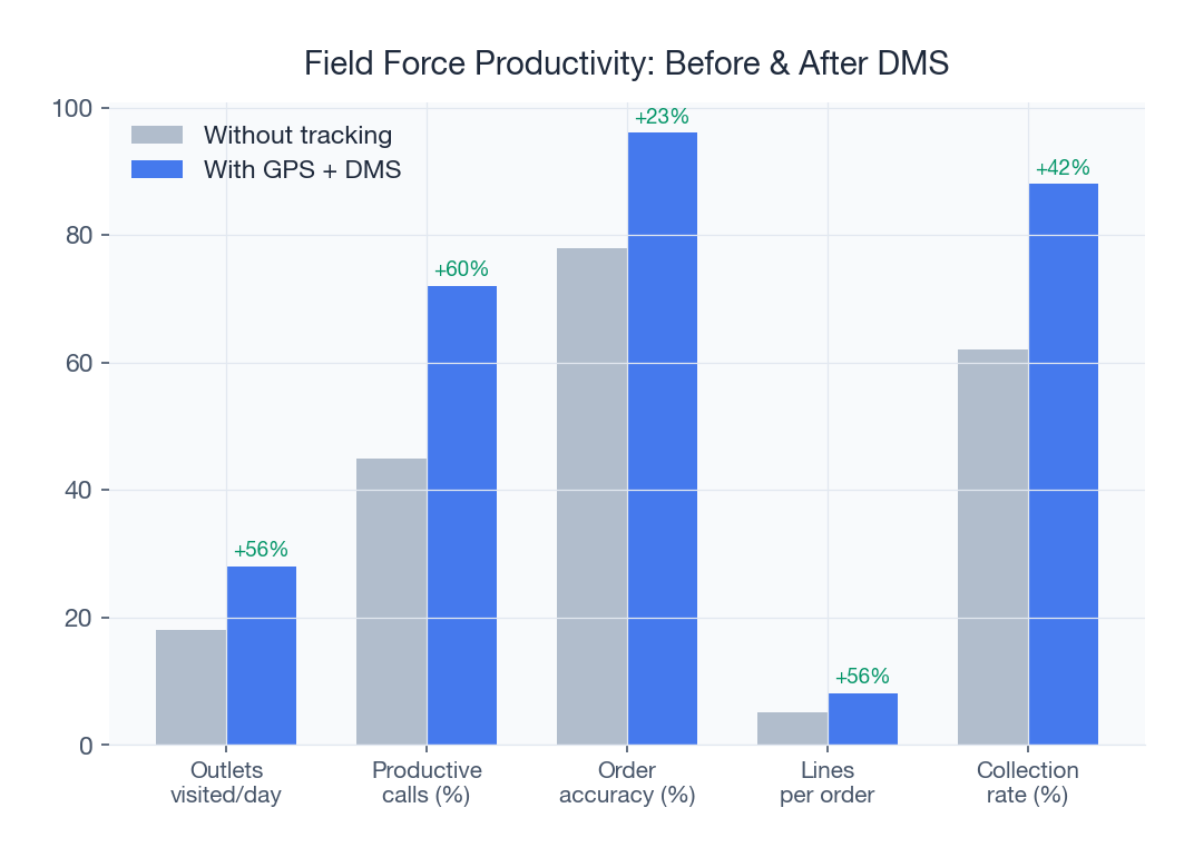
The Results After 9 Months
| KPI | Before Dashboards | After 9 Months | Improvement |
|---|---|---|---|
| Secondary sales vs target | 78% | 94% | +16 percentage points |
| OTIF rate | 82% | 96% | +14 percentage points |
| Outlet coverage | 68% | 89% | +21 percentage points |
| Productive call % | 42% | 67% | +25 percentage points |
| Beat adherence | Unknown | 92% | Now tracked and optimized |
| Returns % | 4.2% | 2.1% | 50% reduction |
| Scheme ROI | Unknown | 2.8x average | Now measured; underperformers cut |
| Claim TAT | 22 days average | 5 days average | 77% faster resolution |
| DSR compliance | 55% | 97% | +42 percentage points |
The financial impact was substantial. Revenue grew 31% year-over-year against an industry average of 12%. Scheme spending was reduced by Rs 38 lakh annually by cutting underperforming schemes identified through ROI tracking. Returns dropped from Rs 62 lakh to Rs 31 lakh annually. Three underperforming distributors were identified and replaced within the first quarter, and six high-performing distributors were identified and rewarded with expanded territories and better margins.
The DataFresh sales head summarized it simply: "We went from guessing to knowing. The dashboard did not change our distribution network. It changed how we managed our distribution network. And that made all the difference."
Getting Started: Your 30-Day KPI Dashboard Action Plan
If you are ready to move from month-end Excel reviews to real-time distribution dashboards, here is a practical 30-day action plan:
- Week 1: Audit your current data sources. What data do you have today? What is its quality? Where are the gaps? Map your DMS, field force app, billing system, and accounting data.
- Week 2: Define your top 5 KPIs and set benchmarks. Use the definitions and benchmarks in this guide as starting points, then calibrate for your specific business.
- Week 3: Implement or configure your dashboard platform. Connect data sources. Build your first 5-KPI dashboard. Set up automated alerts for threshold breaches.
- Week 4: Train your team. Conduct role-based training sessions for CEOs, sales heads, ASMs, and distributors. Set daily and weekly dashboard review rhythms.
The technology is not the hard part. The hard part is building the discipline to look at the data every day and act on what it tells you. Brands that build that discipline consistently outperform those that do not, regardless of category, geography, or scale.
SpireStock has helped over 500 FMCG and dairy companies across India implement distribution KPI dashboards. Book a free demo to see how these 15 KPIs come alive with your own distribution data. Or explore our sales analytics platform, distribution tracking capabilities, and order management module to understand the technology that powers real-time distribution intelligence.
Sources & References
Frequently Asked Questions
The five most critical FMCG distribution KPIs are secondary sales vs target (benchmark 90%+), OTIF rate (benchmark 95%+), outlet coverage percentage (benchmark 85%+), fill rate (benchmark 98%+), and productive call percentage (benchmark 60%+). Together these metrics cover revenue achievement, service quality, market reach, supply chain health, and field force effectiveness.
Start with 5 core KPIs and expand to 15 over 4-6 months. Showing more than 8 KPIs on a single dashboard screen leads to cognitive overload and dashboard abandonment. Use role-based views to show each user only the metrics relevant to their function.
OTIF stands for On Time In Full. It measures the percentage of orders delivered to retailers on time and with the complete ordered quantity. The benchmark for well-managed FMCG distribution is 95%+. Below 90%, you are actively losing retail shelf space to competitors who deliver more reliably.
Distributor ROI is calculated as (Monthly Gross Margin minus Monthly Operating Costs) divided by Total Capital Employed, expressed as a percentage. Capital employed includes stock value, receivables, and infrastructure investment. A healthy benchmark is 15%+ monthly ROI to keep distributors motivated and loyal.
Productive call percentage measures the ratio of retail outlet visits by field sales staff that result in an order being placed versus total visits. The benchmark is 60%+ for established territories. Low productive call percentage indicates issues with SKU assortment, pricing, visit frequency, or sales team effectiveness.
A KPI dashboard transforms distribution management from reactive monthly reviews to proactive daily optimization. Brands using real-time dashboards typically see 15-20% improvement in secondary sales achievement, 50% reduction in returns, faster claim resolution, and better scheme ROI within 6-9 months of implementation.
Four critical data sources feed a distribution dashboard: Distribution Management System (DMS) for sales and inventory data, field force automation app for beat adherence and visit data, billing and invoicing system for financial metrics, and accounting or ERP system for ROI calculations. Real-time feeds from DMS and field force apps are essential.
Beat adherence measures the percentage of planned retail outlet visits that a field salesman actually completes as per the defined beat plan. The benchmark is 90%+. Low beat adherence means some outlets are over-visited while others are neglected, leading to lost sales and uneven coverage.
Related SpireStock Features
Powerful dashboards with sales trends, MIS reports, and distribution analytics.
Real-time GPS tracking of vehicles and drivers with route optimization for faster deliveries.
End-to-end order lifecycle from placement to delivery with multi-level approval workflows.
Geo-tagged attendance with location verification and travel analytics.
Related Industries
Streamline FMCG distribution with order management, beat planning, retailer tracking, and GST billing. Built for Indian FMCG supply chains.
End-to-end dairy distribution software for milk, curd, paneer, and ghee brands. Manage orders, crates, cold chain, and GST billing in one platform.
Related Solutions
Manage your entire distributor network digitally. Onboarding, credit limits, outstanding tracking, and performance analytics. Start free trial.
Boost field sales team productivity with beat planning, GPS attendance, order capture, and performance analytics. Built for Indian FMCG teams.
Track and manage your retail network. Geo-tag outlets, capture secondary sales, manage beats, and monitor retailer performance. Try SpireStock.
Related Entities
Ready to Streamline Your Distribution?
Start your free 30-day trial and see how SpireStock can transform your dairy, FMCG or consumer-goods distribution operation, from order capture to crate recovery.
SpireStock Team
Product & Industry Insights
SpireStock Team leads product at SpireStock, where the team ships distribution management software for India's dairy, FMCG and consumer-goods brands.


